Thursday, March 8, 2012

How We Percieve Color

Color can be used for so many different things.  In fact certain cultures use colors for worship and usually that same color means something different in another culture.  But all in all we see color everyday.  We see it, we associate it with that image and usually it makes sense.  Cheerios uses yellow for their box, what if the box was black?  Would you still buy it?  Yellow can represent happiness, warm, clean, and healthy.  But in some cultures yellows can be used for worship, maybe even war.  All in all color is amazing and you can use it in so many ways.  I believe that any color can work with other colors, it just depends on how you balance that image.  In the photo above you see a grocery store.  Lots of yellows...Oranges, blues, whites, greens...they are all in this image.  Is it a great image?  I think so.  I love how the photographer used what we see everyday to show us that colors are used in hidden advertising techniques.  We see it but we usually do not put the two together.

Colors

The use of color can increase a composition's character, design, emphasis, balance, rhythm and space.  In this image we see the use of all the colors on the color wheel smudged across the page.  This image creates a great rhythmic flow, but there really is no emphasis in any particular place.  I wanted to use this image to show that colors can all be added to create a composition that flows, has balance and unity.  But there is no emphasis.  In fact it is a hard image to look at for a long period of time.  The mixers of colors create tertiary colors and keeps the image both cool in some spots but hot in others.  The magenta, yellow and blues are the main point of this image, but there still are some greens and yellows to balance the image.

Thursday, March 1, 2012

Unity

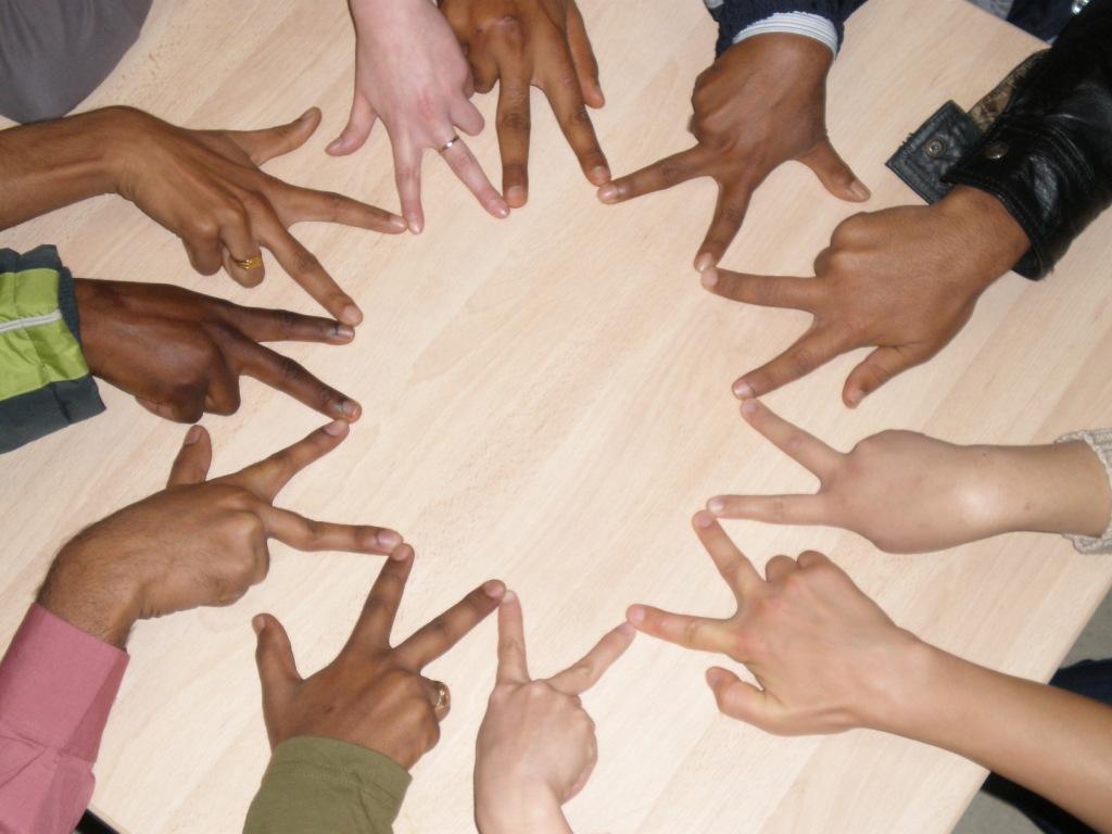
This was an image that I found that def represents unity by grouping, repetition, proximity and continuity.  I love the how the artist used fingers as the shapes to create the shape.   A very clean and well flowing image. 

Rhythm

I was searching for some nice rhythm images, and found this referred as a "joie de vivre" which means "joy of living."  I love the use of color as they do not overwhelm you in the image, but they create a nice smooth transition between the colors.  It is a "joy" to look at and relaxing. 

Thursday, February 23, 2012

Saul Bass Project

This was my take on the Saul Bass project.  I did edit the flyer some more in class but I do not have that copy at home.  But I still wanted to post some of my work.  Thanks for checking it out..

Thursday, February 16, 2012

So Little Time To Get Things Done

Currently I have been extremely busy.  In fact I am stressing just to write this post cause I have soo much going on.  But in life that is how it goes.  Soon there will be images of the project that I have been working on, just need to upload them to this page.  Some Saul Bass work I did and my current 3D project that I have been working on will be featured soon.

Wednesday, January 25, 2012


This is an outside of class project that I did for my band "The Sugar Prophets."  It was a lot of fun creating and designing this handout, which will be passed out during the 2012 International Blues Challenge in Memphis this year.  I was able to have the creative control, however the band manager stood over my shoulder the whole time critiquing the project.   So that was the most stressful part of this.  But wanted to show some of my work outside of class projects.  Everything was designed in Photoshop.  The other image was designed for the ad in the IBC book that will be passed out.  Again same situation, the manager was over my shoulder the whole time.  But we do work very well together and he is a very close friend of mine.  But still it can be stressful working with a "client."