Thursday, March 8, 2012
How We Percieve Color
Color can be used for so many different things. In fact certain cultures use colors for worship and usually that same color means something different in another culture. But all in all we see color everyday. We see it, we associate it with that image and usually it makes sense. Cheerios uses yellow for their box, what if the box was black? Would you still buy it? Yellow can represent happiness, warm, clean, and healthy. But in some cultures yellows can be used for worship, maybe even war. All in all color is amazing and you can use it in so many ways. I believe that any color can work with other colors, it just depends on how you balance that image. In the photo above you see a grocery store. Lots of yellows...Oranges, blues, whites, greens...they are all in this image. Is it a great image? I think so. I love how the photographer used what we see everyday to show us that colors are used in hidden advertising techniques. We see it but we usually do not put the two together.
Colors
The use of color can increase a composition's character, design, emphasis, balance, rhythm and space. In this image we see the use of all the colors on the color wheel smudged across the page. This image creates a great rhythmic flow, but there really is no emphasis in any particular place. I wanted to use this image to show that colors can all be added to create a composition that flows, has balance and unity. But there is no emphasis. In fact it is a hard image to look at for a long period of time. The mixers of colors create tertiary colors and keeps the image both cool in some spots but hot in others. The magenta, yellow and blues are the main point of this image, but there still are some greens and yellows to balance the image.
Thursday, March 1, 2012
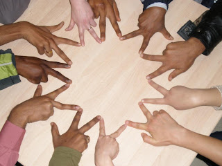
Unity
This was an image that I found that def represents unity by grouping, repetition, proximity and continuity. I love the how the artist used fingers as the shapes to create the shape. A very clean and well flowing image.
Rhythm
I was searching for some nice rhythm images, and found this referred as a "joie de vivre" which means "joy of living." I love the use of color as they do not overwhelm you in the image, but they create a nice smooth transition between the colors. It is a "joy" to look at and relaxing.
Subscribe to:
Comments (Atom)


