Joes Room
Monday, April 30, 2012
Reflection
In my reflection on the year, there has been a lot of information that has been extremely useful to me and my degree. Even though I am not a Design Student, I learned new concepts, elements of design and new visual concepts that will help m,e in the future. In fact with the understanding of Illustrator and how it can be used, I now can help develop web-sites, banners, flyers, and as well I can use this program to help with texturing in Maya, a new idea that I learned this weekend. I recommend a design course to anyone wishing to be a part of 3D Animation, Game Design, Photography, Web Development, and Design. If you decide to go to a community college, come to Parkland College in Champaign, they have a great program that will help you develop the skills that you need to become successful in the area of Digital Media.
Friday, April 13, 2012
One Image, Many Thoughts
The immediate response is April. Baseball season. Warm air, the smell of hotdogs. The taste of a cool refreshing beverage. Remember little league. High School, the games with dad in Boston.. Its amazing how an image can bring back so many memories, all good, with the simple image of a round object. That's why I choose this image this week. The simplicity, the reference, the metaphor, the cliche. It all is there in the simple round image of the baseball.
Friday, April 6, 2012
Where are you?
A great use of color, lighting, balance, and layout. There is much drama in this image and a bit of a metaphoric idea. I say that because the image is in a perspective layout that comprehends colors that give you a sense that your are on a hill getting ready to move towards the town. Maybe you can relate to the image by thinking how far the travel is to get where you want to be? What type of obstacles are in your way? If any? Are you feelin cold or warm in this image? Where are you in time? When you look at this piece you find yourself not just looking at the image in whole but in bits and pieces throughout. That is what makes this image so powerful to view and comprehend.
Sunday, April 1, 2012
Maps
Our next project involves the concept of maps. So what is the goal? To create a map using design techniques and Adobe Illustrator. My goal is to create a map that is based off of my trip to Parkland College each day. The roads I take and the area that I pass by. Not too crazy, but still a little more difficult to accomplish. I have been research colorful maps that present cool imagery without emphasizing on street names. Here is a great example of such. The Tampa Bay area, looks small, but the map does create this excitement that sends a thought of vacation. The addition of the cruise boats to the pirate ship and the neat illustration of the downtown and of course the waterways. To me this is what I would like to recreate for my own map.
Thursday, March 8, 2012
How We Percieve Color
Color can be used for so many different things. In fact certain cultures use colors for worship and usually that same color means something different in another culture. But all in all we see color everyday. We see it, we associate it with that image and usually it makes sense. Cheerios uses yellow for their box, what if the box was black? Would you still buy it? Yellow can represent happiness, warm, clean, and healthy. But in some cultures yellows can be used for worship, maybe even war. All in all color is amazing and you can use it in so many ways. I believe that any color can work with other colors, it just depends on how you balance that image. In the photo above you see a grocery store. Lots of yellows...Oranges, blues, whites, greens...they are all in this image. Is it a great image? I think so. I love how the photographer used what we see everyday to show us that colors are used in hidden advertising techniques. We see it but we usually do not put the two together.
Colors
The use of color can increase a composition's character, design, emphasis, balance, rhythm and space. In this image we see the use of all the colors on the color wheel smudged across the page. This image creates a great rhythmic flow, but there really is no emphasis in any particular place. I wanted to use this image to show that colors can all be added to create a composition that flows, has balance and unity. But there is no emphasis. In fact it is a hard image to look at for a long period of time. The mixers of colors create tertiary colors and keeps the image both cool in some spots but hot in others. The magenta, yellow and blues are the main point of this image, but there still are some greens and yellows to balance the image.
Thursday, March 1, 2012
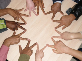
Unity
This was an image that I found that def represents unity by grouping, repetition, proximity and continuity. I love the how the artist used fingers as the shapes to create the shape. A very clean and well flowing image.
Subscribe to:
Comments (Atom)


